Method 1
# -*- coding: utf-8 -*-
"""
Created on Thu Aug 22 21:51:56 2019

@author: Hsuey
"""

#import matplotlib
import matplotlib.pyplot as plt
import numpy as np


labels = ['G1', 'G2', 'G3', 'G4', 'G5']
men_means = [20, 34, 30, 35, 27]
women_means = [25, 32, 34, 20, 25]

x = np.arange(len(labels))  # the label locations
width = 0.35  # the width of the bars

fig, ax = plt.subplots()
rects1 = ax.bar(x - width/2, men_means, width, label='Men')
rects2 = ax.bar(x + width/2, women_means, width, label='Women')

# Add some text for labels, title and custom x-axis tick labels, etc.
ax.set_ylabel(r'$Scores$')
ax.set_title(r'$Scores by group and gender$')
ax.set_xticks(x)
ax.set_xticklabels(labels)
ax.legend(loc="upper left")


def autolabel(rects):
    """Attach a text label above each bar in *rects*, displaying its height."""
    for rect in rects:
        height = rect.get_height()
        ax.annotate('{}'.format(height),
                    xy=(rect.get_x() + rect.get_width() / 2, height),
                    xytext=(0,5),  # 3 points vertical offset
                    textcoords="offset points",
                    ha='center', va='bottom')


autolabel(rects1)
autolabel(rects2)

fig.tight_layout()

plt.show()
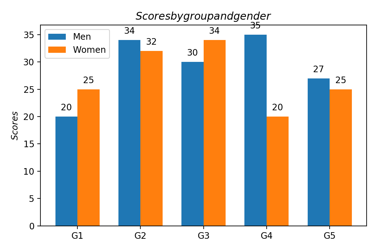
效果如下:

Method 2
# -*- coding: utf-8 -*-
"""
Created on Thu Aug 22 09:30:58 2019

@author: Hsuey
"""

import numpy as np
import pandas as pd
import matplotlib.pyplot as plt

train = pd.read_csv('train.csv')
n_groups = 3;
index = np.arange(n_groups)
bar_width = 0.35
opacity = 0.7
PclassSurvived = train[train.Survived==1].Pclass.value_counts().sort_index()
PclassDied = train[train.Survived==0].Pclass.value_counts().sort_index()
plt.bar(index - bar_width/2,PclassSurvived,bar_width,alpha=opacity,
        color='r',label=r'$Survived$')
plt.bar(index + bar_width/2,PclassDied,bar_width,alpha=opacity,
        color='y',label=r'$Died$')
plt.xticks(index,(1,2,3))
plt.xlabel(r'$Pclass$')
plt.ylabel(r'$Number of Passengers$')
plt.legend(loc="upper left")
def autolabel(X,Y):
    for x,y in zip(X,Y):
        plt.text(x,y,y,ha='center',va='bottom')
autolabel(index - bar_width/2,PclassSurvived)
autolabel(index + bar_width/2,PclassDied)
plt.savefig("./tempimages/Survived",dpi=200)
plt.show()
print(pd.crosstab(train.Pclass,train.Survived,margins=True))
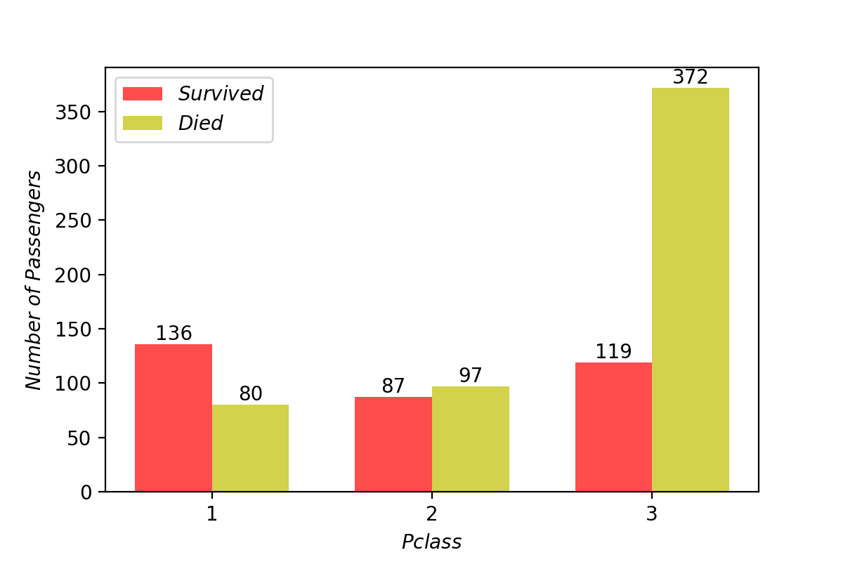
效果如下:


